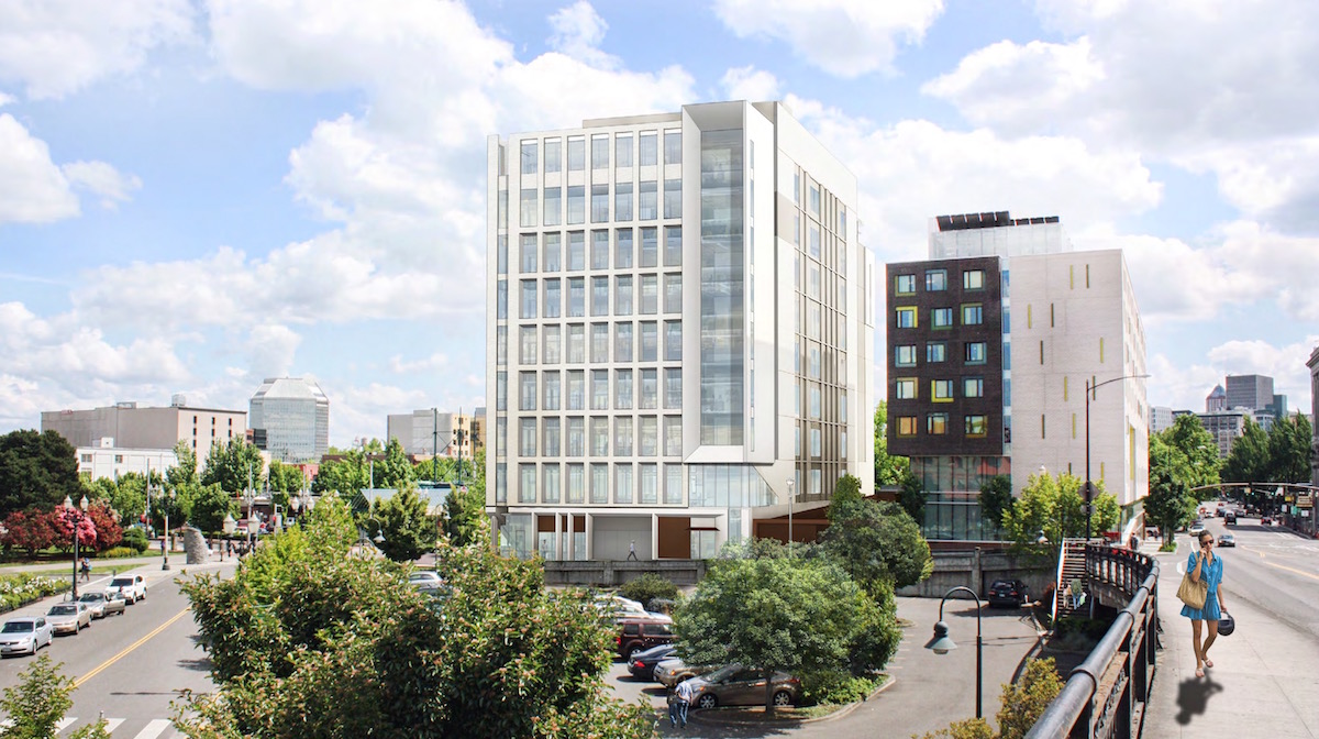
ZGF Architects have gone before the Design Commission to receive Design Advice on the new Multnomah County Health Department Headquarters. The 9 story, 148′ tall, building will house clinical functions, associated workplaces, and administrative offices for the Health Department. At the ground level the building will include a pharmacy and work space, a “gallery” facing the street, and a potential lease space. Floors 2 to 4 will be occupied by clinic and clinic administration spaces. Floors 5 to 9 will mostly be occupied by office space, with a south facing terrace at the 9th floor. The majority of roof area will be covered by an ecoroof. No vehicular parking is proposed.
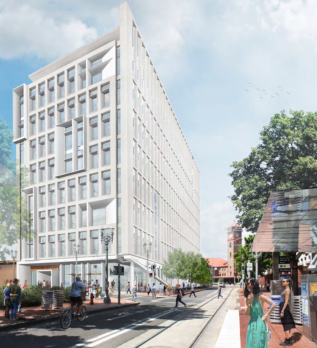
The half block site at NW 6th & Hoyt is currently vacant land, owned by the City of Portland Housing Bureau. The Bureau intends to convey the property to Multnomah County at no cost. The western half of the block is occupied by Bud Clark Commons, a housing and resource center for the homeless which opened in 2011. In 2015 the Portland City Council increased the maximum allowable height on the site from 75′ to 150′ through a Zoning Map Amendment.
The primary materials proposed for the building include light colored brick, cementitious panels and site cast concrete.
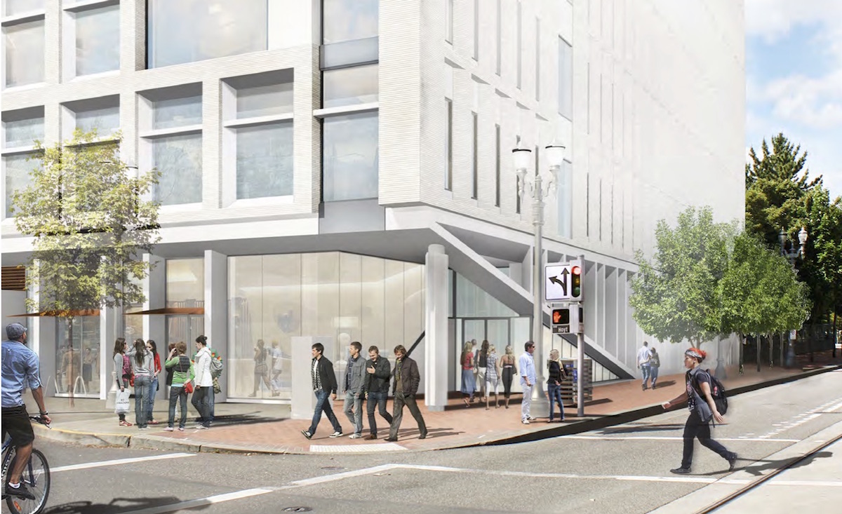
A Memo to the Design Commission [PDF], published before the April 14th advisory hearing, outlined staff issues for the Design Commission to discuss. These included: massing and scale as the building relates to Bud Clark Commons, including whether the west elevation should include more windows and masonry and less metal trim; scale and coherency of the facades, including the fact that each elevation is different; the design coherency of the ground floor, including the lack of active uses facing the street; and the loading area location and width. The Design Commission all agreed with the issues raised by the Bureau of Development Services Staff, though had some disagreement about the major design moves of the building. Commissioner Savinar was largely in support of the building:
It’s a very muscular building, however I find it quite exciting. I think the key will be in not seeing an all white drawing, but actually seeing the next iteration and really understanding where the panels are, where the brick is, and really understanding all of that. Then we’ll know whether it’s a relic from PSU’s days or whether it’s something we’re looking forward to… but I’m very excited about the building, with a few exceptions. There’s no way I can accept the east face at the street level: the structure coming down to the sidewalk is putting up a wall in front of a wall.
Commissioner Vallaster was however much more skeptical about the design:
I’m still having a hard time with the form. In particular the selection of why here, why this particular composition? I know Tad [Savinar] often talks about “this looking like a graphic design”, rather than a real building, and that’s the problem I have with this. It’s basically what it is—a two dimensional graphic. Look at the end of a building: it doesn’t have any particular relevance to what’s going on inside the building (which could change), but also any context in the neighborhood [either].
The Multnomah County Health Department will be required to go through a Type III Design Review with public hearings before the Design Commission. The applicants have the option of returning for a second Design Advice Request hearing, though no date has been set.
Drawings
-
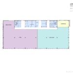
- Plan – Level 1
-
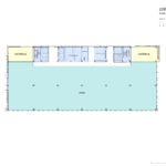
- Plan – Levels 2 to 4
-
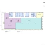
- Plan – Levels 5 to 8
-
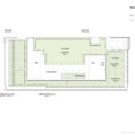
- Plan – Level 9
-
- Plan – Roof
-
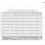
- Elevation – East
-
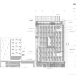
- Elevation – South
-
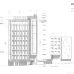
- Elevation – North
-
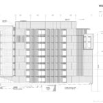
- Elevation – West
“Then we’ll know whether it’s a relic from PSU’s days or whether it’s something we’re looking forward to…”
I’m glad this was mentioned. This is looking like a brutalist building, not something I think Portland needs any more of.
Brutalism as a style is passé. Whoever has to clean the windows on this new building will have an unenviable task. Typical government failure of design. Sad.
Don’t be obnoxious, it won’t be any harder than washing the windows of the Bud Clark Commons next door. Look at Paul Rudolph’s work. Not all brutalist buildings are bad.
I think this building looks interesting. Ground floor’s a little weird, but promising overall.
I actually kind of like it. Seems like every new tower in Portland looks the same – either all glass, or concrete and metal with asymmetrical window layouts – so it’s nice to finally see something different.
It’s white. Just white. It’s also very “muscular,” I agree. I would never have thought to use that word, but it seems appropriate. I admit that one thing I often dislike about architecture is its lack of color; when they do use color, they often use it badly. This neighborhood is old, and historic Union Station is next door. Would it kill them to use red brick? It amazes me how often people instead select variations of beige instead of actual color. I also intensely dislike the fenestration. I will admit that I really detest brutalism, so I don’t think there’s any way this building would ever get approval if I were decision maker. Also, white does not necessarily do well in a wet climate. It gets dirty easier. I really think the color and form need totally redoing. Granted, it’s better brutalism than what’s to be found around PSU. It’s not so severe, but those windows and color are still really unpleasant.
Why does the exterior of the building have to have any relevance to the functions of the the interior? If there is a code violation that’s one thing, if it’s aesthetic preference, then i find the comment irrelevant. I would love to see something with more geometric purity in this city and believe that Brutalism (done well) is way more pleasing than most current architecture going up in Portland. Being critiqued as an expression of graphic design is the opposite of a pejorative IMHO.. Good show on ZGFs part. I hope it says interesting and does not get dumbed down..