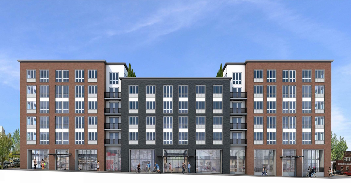
SERA Architects have gone before the Design Commission to receive Design Advice on a new project at NW 17th and Kearney. The 6 story building for Holland Partner Group would contain 120 apartments (including 9 ground floor units), with 2,800 sq ft of retail space at the ground level. 68 parking stalls are proposed in one level of below grade parking. At the 6th floor a club room and roof terrace deck is proposed. Subject to a property tax exemption being approved by the City Council, 20% of the project’s unit will be affordable to those earning less than 80 percent of area median family income.
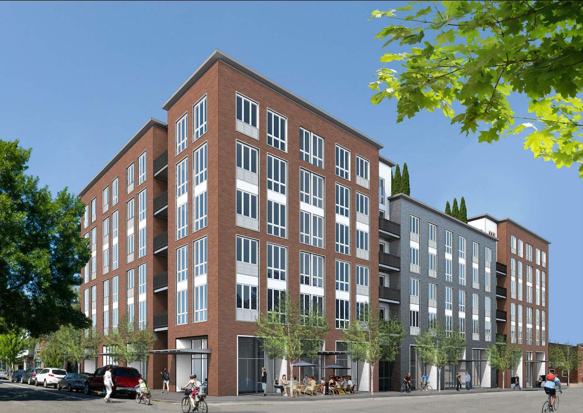
The roughly half-block site at 905 NW 17th Ave is currently occupied by a low rise light industrial building, built in 1931. The building is presently used by Ad-Mail, Inc, who will be relocating their business to another site in the metro area.
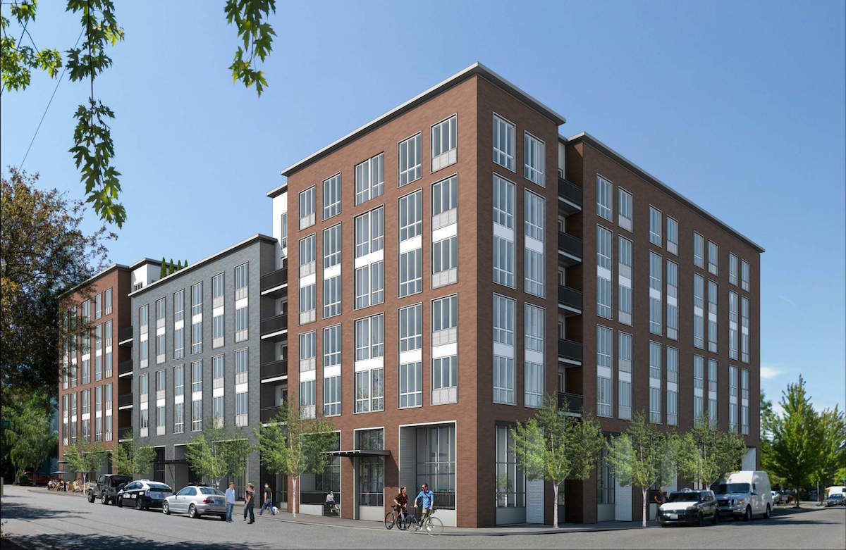
Materials proposed for the building include: brick, in three colors (white, red, gray), stucco; VPI vinyl windows; aluminum storefront; metal louvers; and metal balconies.
The project went before the Design Commission on July 21st. A Staff Memo [PDF], published before the hearing, outlined suggested areas for discussion. These included: the massing, scale and facade composition, including where the building is overly modulated for a half block development; the design character, and whether the building has a “singular compelling residential character”; the ground floor program; the upper floors, including whether the building has sufficient balconies; and the materials proposed. Though supportive of the project as a whole, the Design Commission generally agreed with the staff comments.
To gain approval the building will be required to go through a Type III Design Review, with public hearings before the Design Commission.
Drawings
-
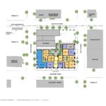
- Plan – Site
-
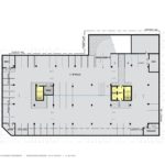
- Plan – Level P1
-
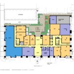
- Plan – Level 1
-
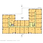
- Plan – Levels 2 to 5
-
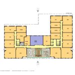
- Plan – Level 5
-
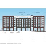
- Elevation – South
-
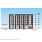
- Elevation – East
-
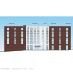
- Elevation – North
-
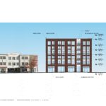
- Elevation – West
This is a bizarre design. It attempts to “break up the massing” with the appearance of 3 smaller buildings but then it is also symmetrical? Maybe this is a cheaper way to design (mirror command?) but it does not represent anything that would be found in an urban environment that it appears to be trying to replicate. Also – why so many mullions??? Especially on cheap windows all those mullions look terrible.