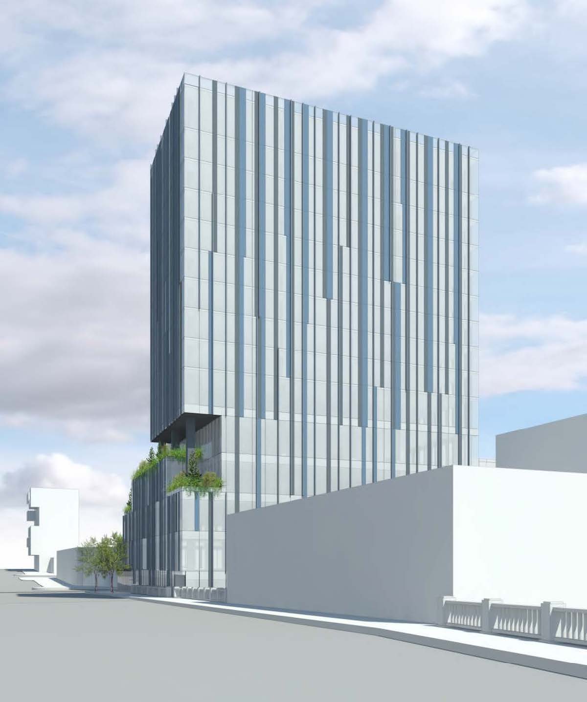
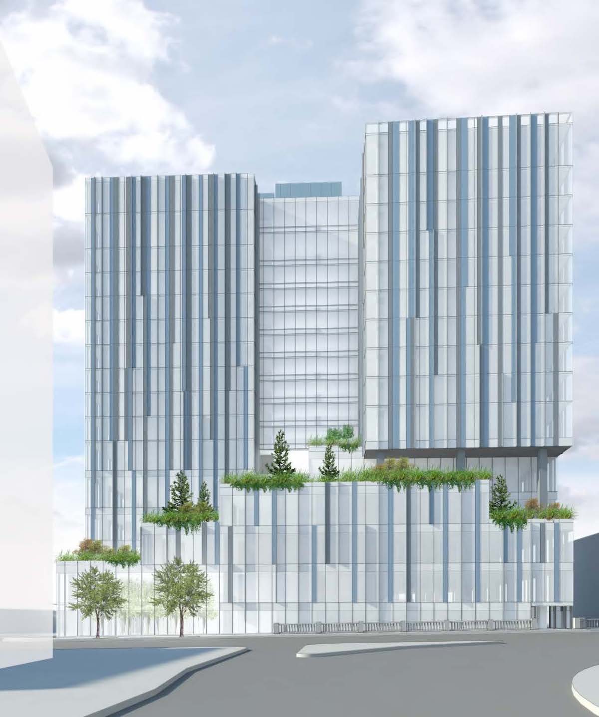
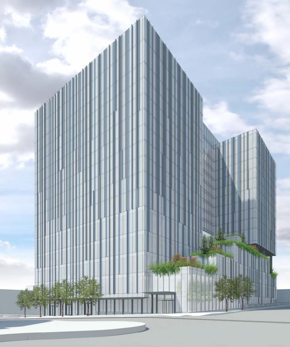
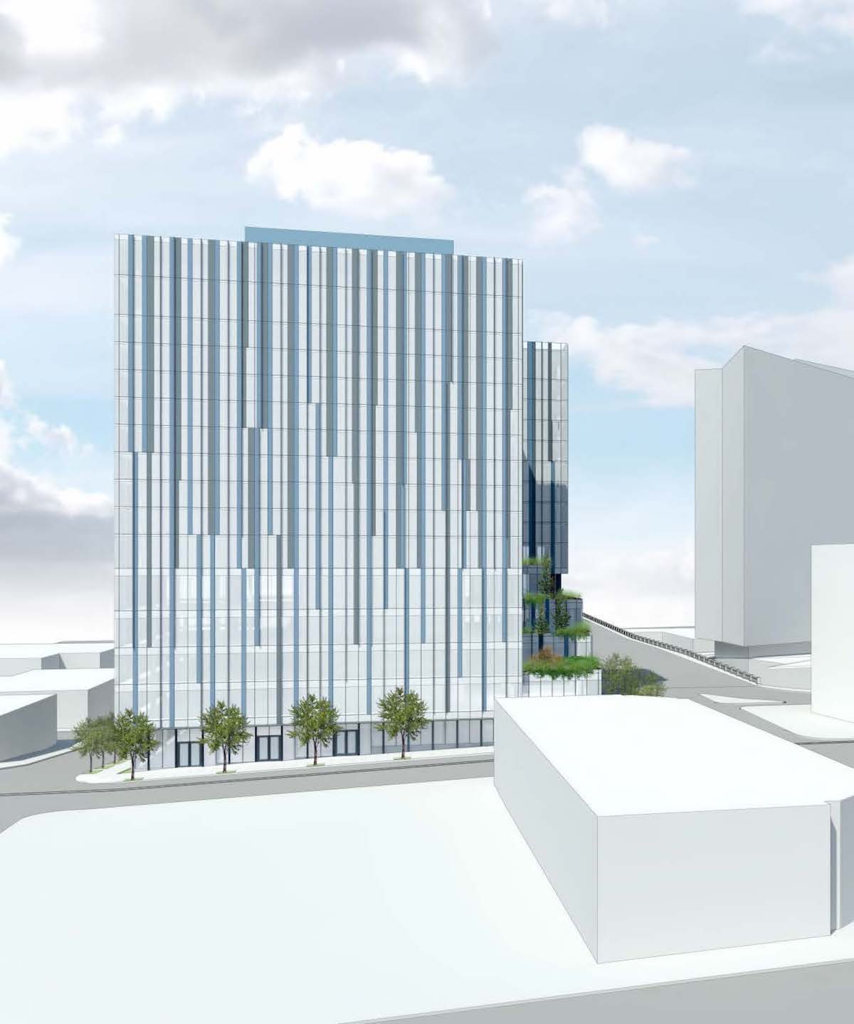
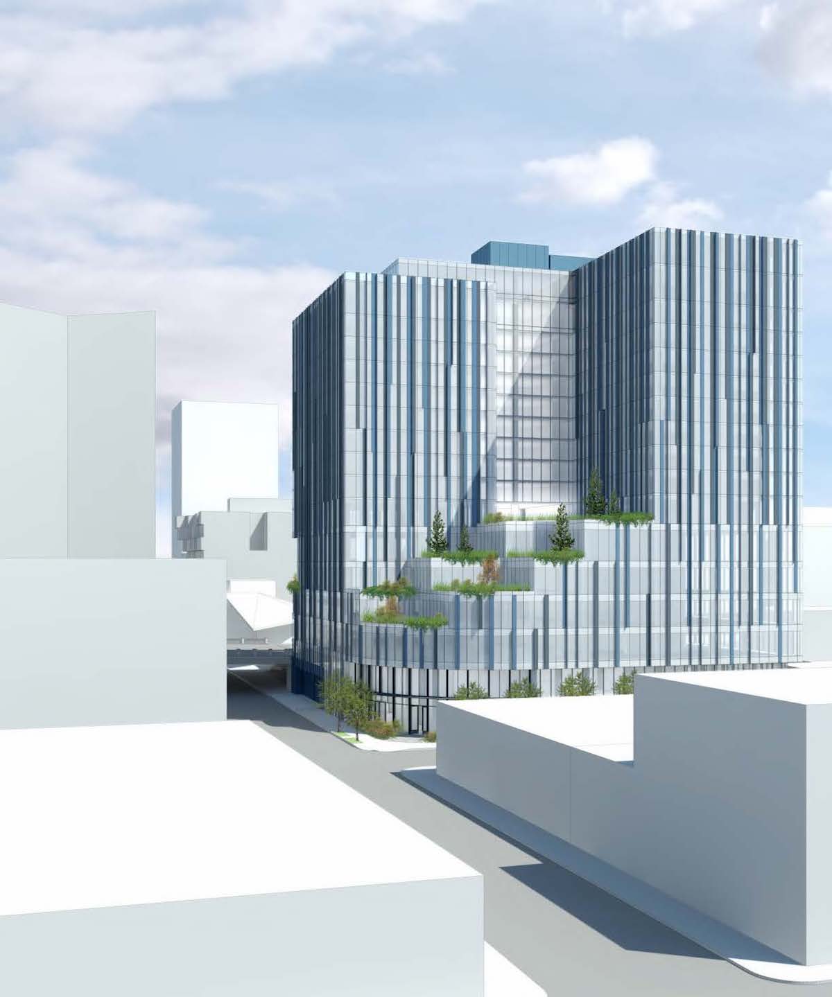
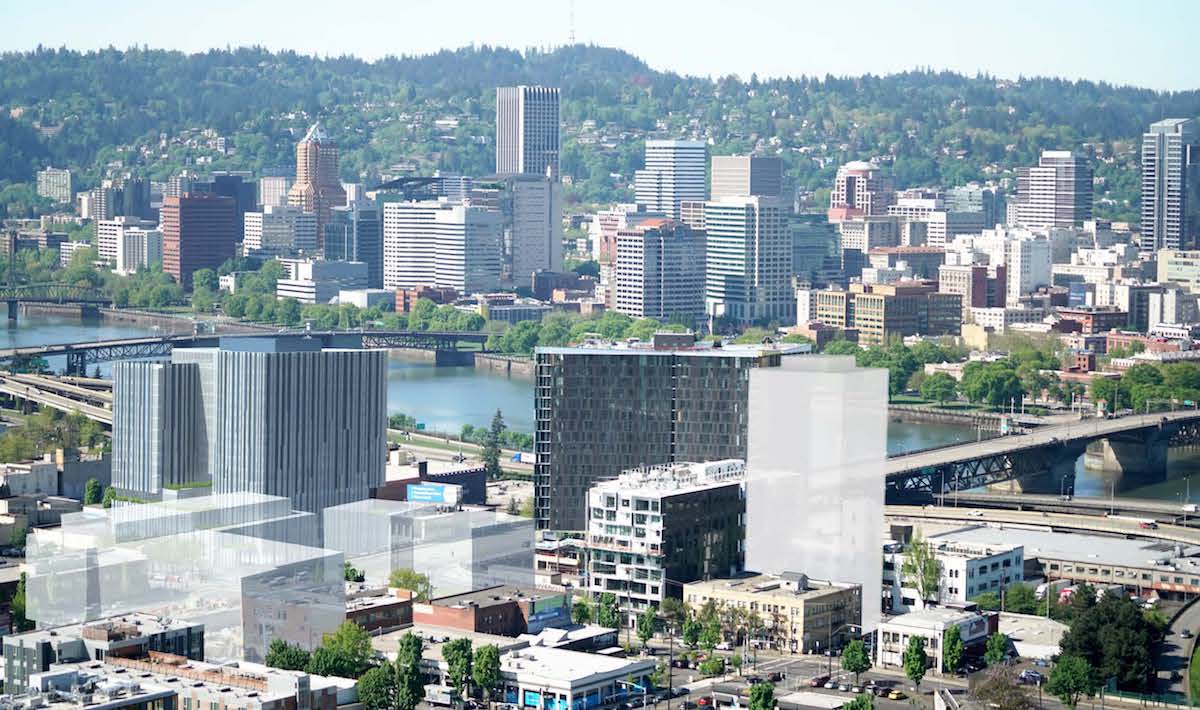
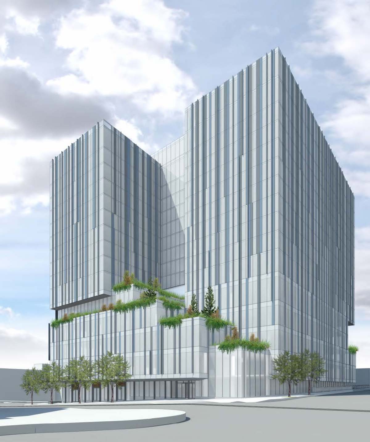
5 MLK, the 17 story Burnside Bridgehead tower, has returned in front of the Design Commission for a third Design Advice Request hearing. The design of the project is by Chicago based GREC Architects, for Portland based developer Gerding Edlen. The 200′ tall building is arranged as a five story podium, which would contain approximately 100,000 sq ft of office space, 10,000 sq ft of retail space, 160 vehicular parking spaces and 5,000 sq ft of bike storage. Sitting above the podium is a twelve story tower, which would contain approximately 220 residential units. At the ground level a shared lobby, serving both the residential and office uses, would be located at the corner of E Burnside and SE MLK. A cascading series of landscaped terraces would be located on top of the podium, with landscape design by PLACE. The uppermost terrace, at level 6, would be directly adjacent to building amenity features including a fitness room, lounge, dog room, and yoga studio.
The building will be located at the site that was until recently home to Fishels Furniture. According to a 1988 survey [PDF] the existing quarter block building at 5 SE Martin Luther King Jr Blvd was built circa 1900, to designs by an unknown architect. The building is described as “typical of others of its type which consist of a first floor retail space with offices above”. Other buildings on the same block, also used by Fishels Furniture, are listed on portlandmaps.com as constructed in 1920, 1941 and 1953. Fishels Furniture was founded in 1921, and announced in April 2016 that they would be closing following a liquidation sale.
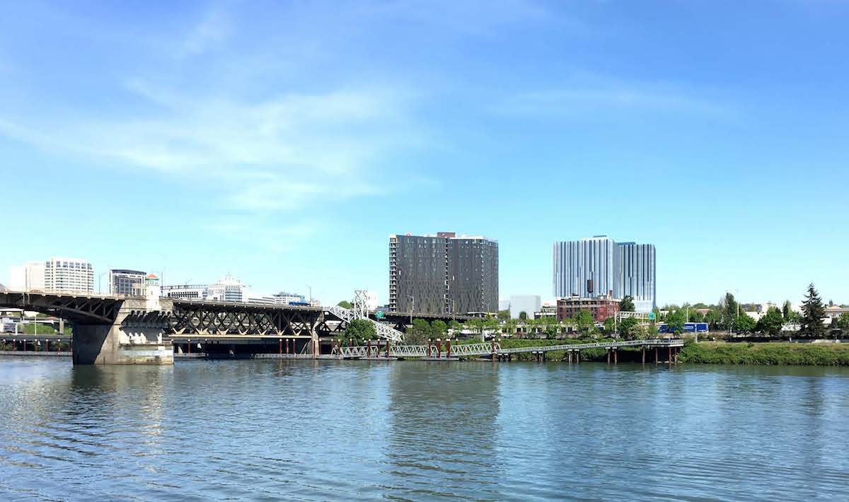
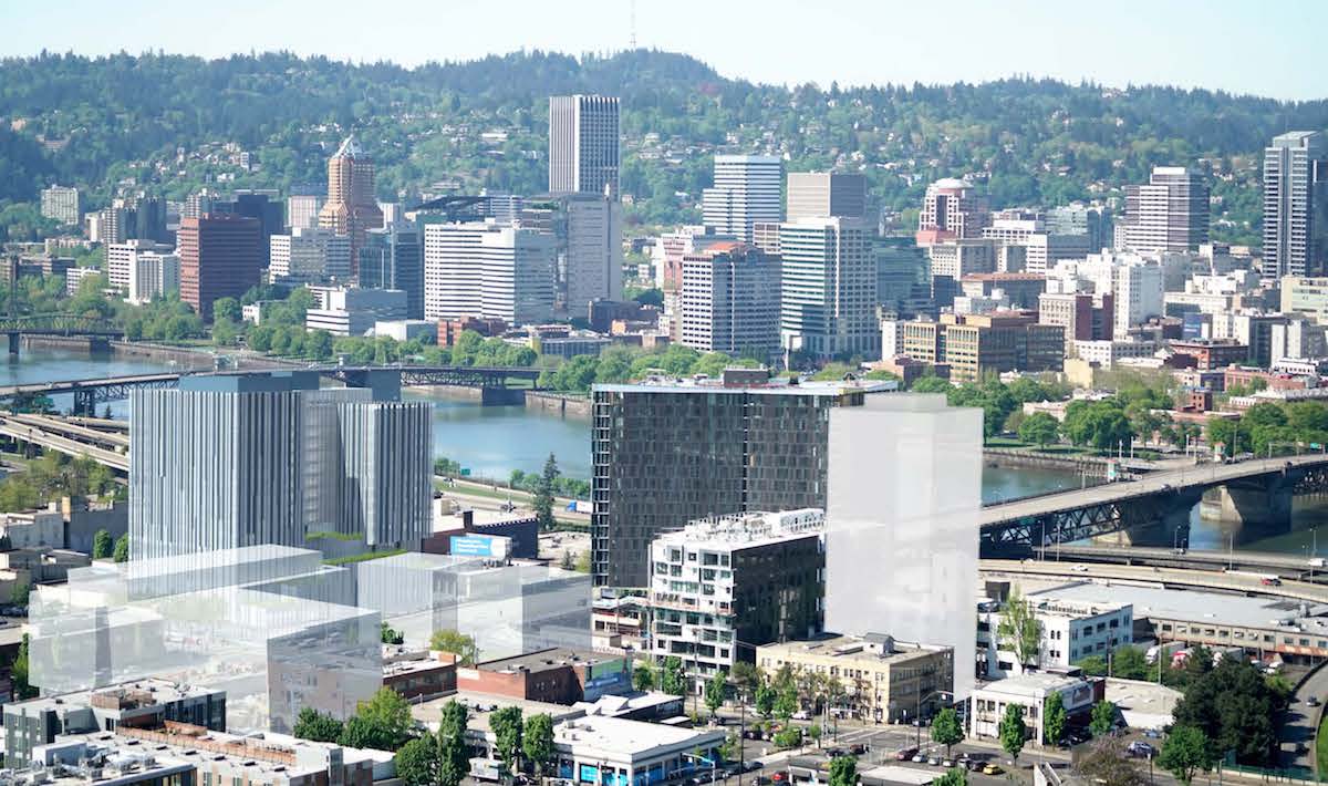
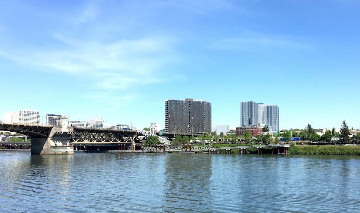
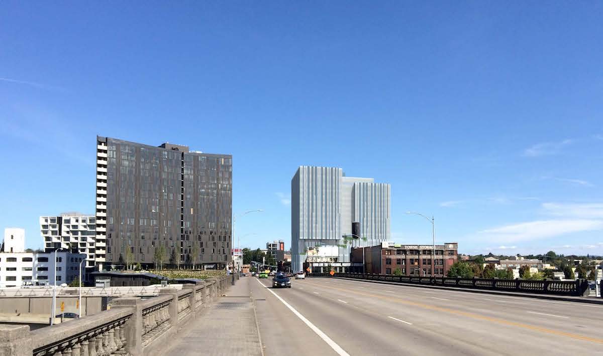
The surrounding area at the east end of the Burnside Bridge is growing rapidly. Nearby projects under construction include Yard, Slate, 419 E Burnside and the renovation of the Towne Storage Building. Planned buildings in the lower E Burnside area include the Fair Haired Dumbbell, Block 75 Phase II, the Jupiter Hotel Expansion, 710 E Burnside and the Burnside Delta.
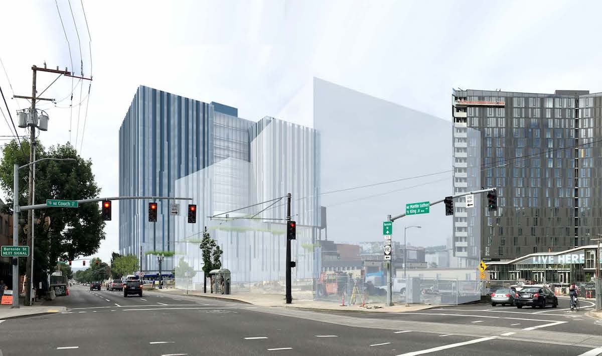
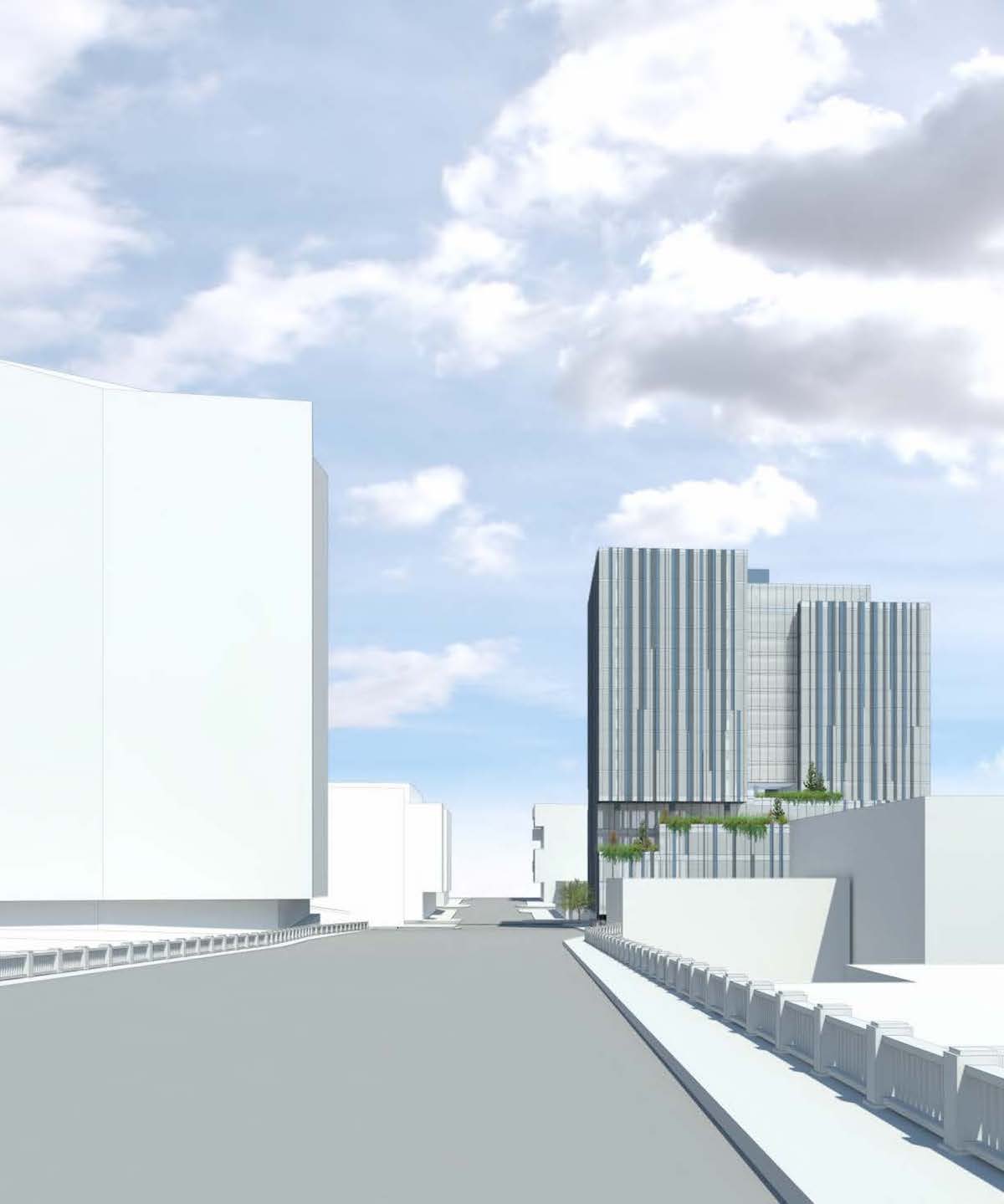
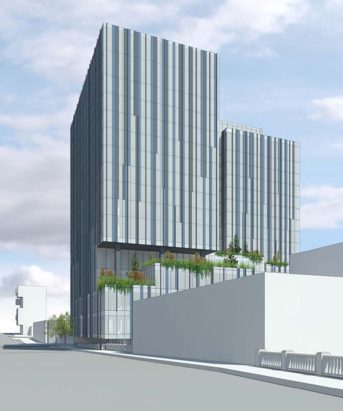
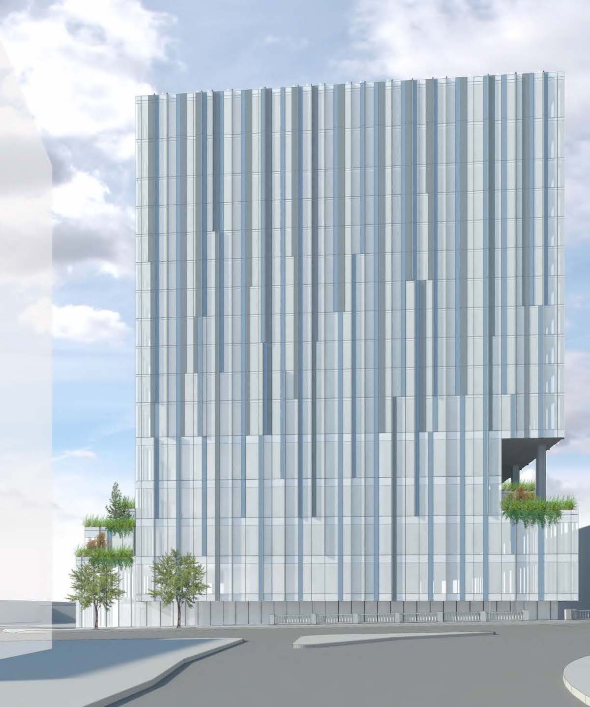
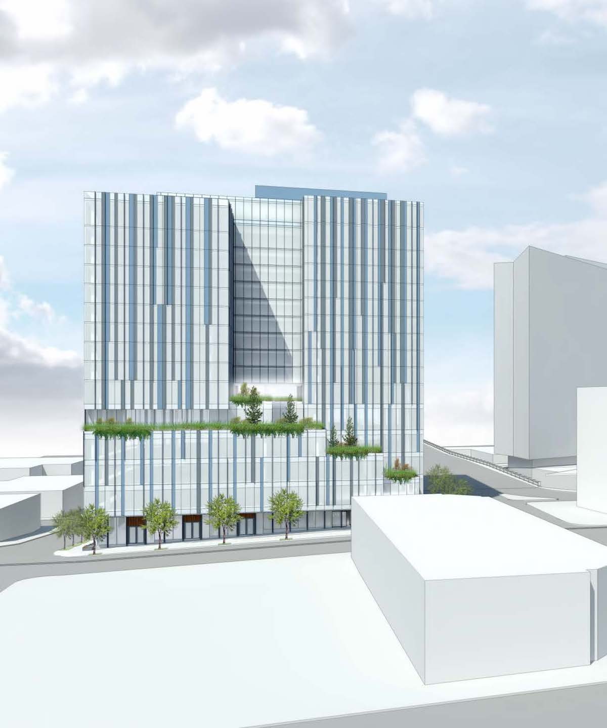
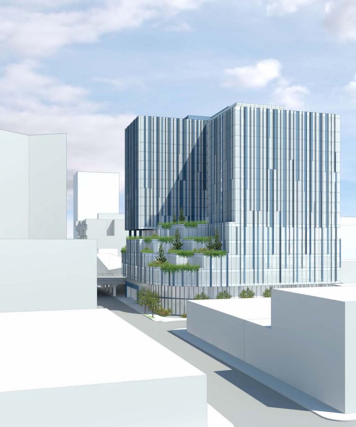
In response to feedback given at the second Design Advice advice hearing, the architects have moved forward with two schemes–conceptually named “Layers A” and “Layers B” based on the “pinwheel” options previously presented. The “west wing” massing options, originally presented at the first Design Advice hearing are no longer being pursued. In both schemes the office base and residential towers are clad with a glass curtain wall system, described by City staff as incorporating “a series slightly-shifting vertical elements which disintegrate as they move from the top to the base of the building”.
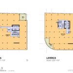
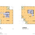
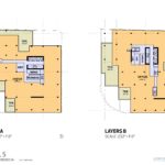
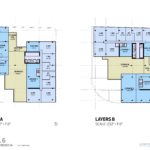
Layers A
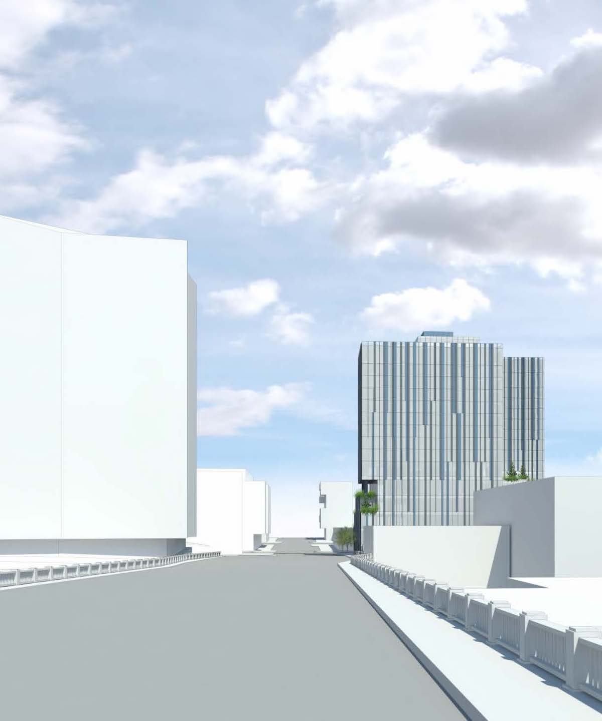
In the “Layers A” massing option the mass above the podium is arranged as two parallel towers, arranged in a north-south orientation. These are linked by a bridge element at the center of the block. The western most tower would be one story shorter than the eastern tower, with an amenity roof deck located at the 17th level.

Layers B
The “Layers B” massing option is similar to “Layers A”, with the major change being that the two parallel towers would be arranged in an east-west orientation. The southern tower would be the shorter of the two tower, and would also have an amenity roof deck located at the 17th level.
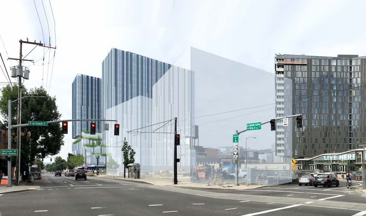
A Bureau of Development Services Staff memo [PDF] to the Design Commission, published before the October 20th hearing, outlined the changes made since the prior hearing, as well as potential areas of discussion. The major discussion items identified were: whether the massing and facade concepts successfully unify the towers and the base; whether the the two towers should read as more distinct massing elements from the podium/terraces; and whether one orientation of the “Layers” concept more successful than the other.
The changes made were very well received by the Design Commission. A slight majority of the Commission, consisting of Commissioners Livingston, Clarke and Molinar, preferred “Layers A”. Commissioners Wark and Vallaster preferred “Layers B”, particularly when seen from across the river, but noted that either would be acceptable. During the hearing Commissioner Livingston explained why she thought “Layers A” was the better massing choice:
My sense of this is that “A” responds very well to the guidelines, [as related to] the view of the building from a distance, both from the west side and the east side. It seems as though the massing facing the river and facing MLK reads very strongly, and the bridge piece that in scheme “A” faces the Burnside Bridgehead developments really does a lot to enhance the character of that urban space. David [Wark], you had made some comments about the base of the building, where the lobby is, and the fact that it steps down to two stories, that it may not want to do that… I actually think the way the building is carved at that edge really does a lot to reinforce the character of the whole Burnside Bridgehead area. My sense of this is that you’ve done a lot of work on the facade, and it is reading much more clearly now. The integration of the two pieces is definitely moving in the right direction. The “A” scheme responds more fully to guidelines–especially the gateway issues that we discussed last time–than the “B” scheme does.
5 MLK is now expected to move forward with an application for a Type III Design Review, which will require public hearings in front of the Design Commission.
Drawings
-
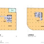
- Plans – Lower Level 3
-
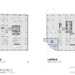
- Plans – Lower Level 2
-
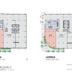
- Plans – Lower Level 1
-
- Plans – Grade Level
-
- Plans – Level 2
-
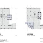
- Plans – Level 3
-
- Plans – Level 4
-
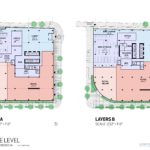
- Plans – Level 5
-
- Plans – Level 6
-
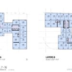
- Plans – Levels 7 to 16
-
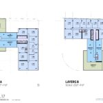
- Plans – Level 17
-
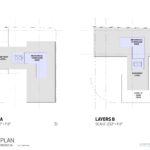
- Plans – Roof
-
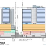
- Sections
Where to begin… Perhaps we should start with what the heck is going on with the Design Commission? This is an improvement over the previous options? I am struggling to find a coherent and consistent voice with the commission’s findings and feedback. ZGF’s Multnomah County Health Building was considered too graphic and yet this is not? This is virtually 100% graphic. Yes there is a greater coherence with the tower and the base on this proposal but at what cost to the overall design? What did the Commission suggest in the previous two DARs that would lead the designers to this place? Anchoring one of the primary gateways to the Central Eastside with a soulless sleek reflective glass graphic skin mass is a choice with little context to support. Is this really where we’re heading? Am I misguided to expect more sensitivity from Gerding Edlen to site, place and the selection of the design team? This proposal does not need a few tweaks. It needs to go back to the drawing board with a focus on creating a signature gateway building sensitive to its context above the need to maximize every damn squire inch of available FAR. Given the failure of YARD to live up to its rendered promise, it is even more important to get this side of the bridgehead right.
I’m glad to see the sidewalk at the corner of SE Ankeny and 3rd is squared up. Now there’s no motivation to curve that corner of the building. But by this point, I guess they’re used to that curve, so they’re keeping it!
The curve follows the property line. While they could apply for a street vacation, the fact that the vacation process takes over a year has dissuaded them from pursuing it.
That’s too bad. It’s unfortunate that even a big project like this won’t pursue that. I understand that some vacations are controversial, but when the process discourages even a change that everyone would agree with, by those who could afford to do it, are dissuaded, perhaps the process should be streamlined.
WHAT!? Damn… I miss the previous designs. This is just… bad.
I will join the chorus and agree that the previous facade was better. Now we have black and grey behemoths at the Bridgehead.
This building is kind of neat looking, in an abstract sort of way, and I think it’s better than the previous designs. But it does not look like a building that people might live or work in. Unwelcoming and strangely blank.
Point towers
Nuff said
Icky. Cold and icky. At least the earlier versions had a certain warmth about them. But this thing? I guess it’ll look right at home across from that sinister looking brown thing.
Actually, the pair together makes me think of the gates of Mordor for some reason…..
Looks like a SimCity rendering glitch.
I’d rather see three new 6-story buildings occupying three currently vacant lots than a 17-story building occupying just one, although it might not pencil out as well for developers. Tall-buildings just seem like an over-engineered and overly expensive method of generating a mixed use urban setting, and many dislike the aesthetics, particularly when they’re built outside of downtown. Personally, I don’t mind the ugliness too much, as the inner east side is still predominantly industrial and already ugly, so whatever. Not really optimal though.
I agree strongly with David Dysert when he says “Anchoring one of the primary gateways to the Central Eastside with a soulless sleek reflective glass graphic skin mass is a choice with little context to support. Is this really where we’re heading?” I have worked in the SE Industrial District for 10 years (and worked in the Pearl for nearly a decade before that). That location is indeed the “gateway” to the district and, what ever one thinks of the actual proposed building design, it seems to lack any reference or provide any respect to the district’s history and culture. Please don’t plant a gleaming Pearl district “gem” on our East side! In addition, The Fishel’s building that has occupied the site for 100+ years is not a fancy or even noteworthy piece of architecture, but it is an important symbol of the commerce and industry that shaped the area and Portland. Tearing it down is a slap in the face to all that has gone before. Gearding Edlin has experience, and I thought some commitment to, preserving important pieces of the past while creatively adapting and integrating structures for future use. I thought the days of urban renewal by wrecking crane were behind us. Please summon your creative powers to avoid the wanton destruction of more of Portland’s historic architectural fabric!