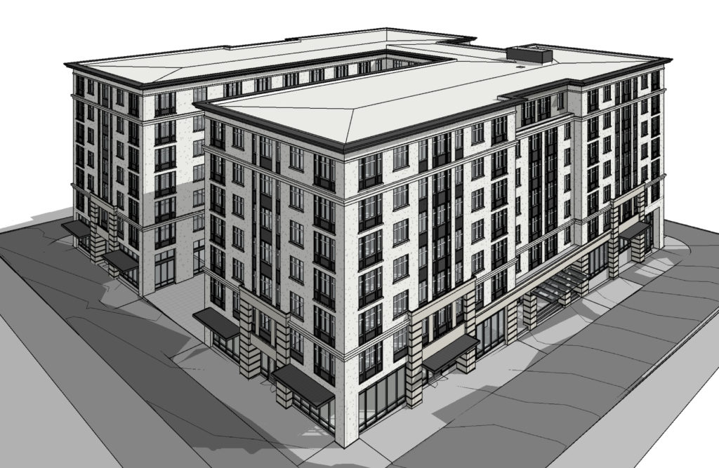
Design Advice has been offered on the Modera Morrison, a 7-story building being designed by SERA Architects for Mill Creek Residential Trust. The project would include approximately 245 units, with two levels of below grade parking.
The building will be subject to the city’s inclusionary housing rules, which require the provision of affordable housing or the payment of a fee-in-lieu.
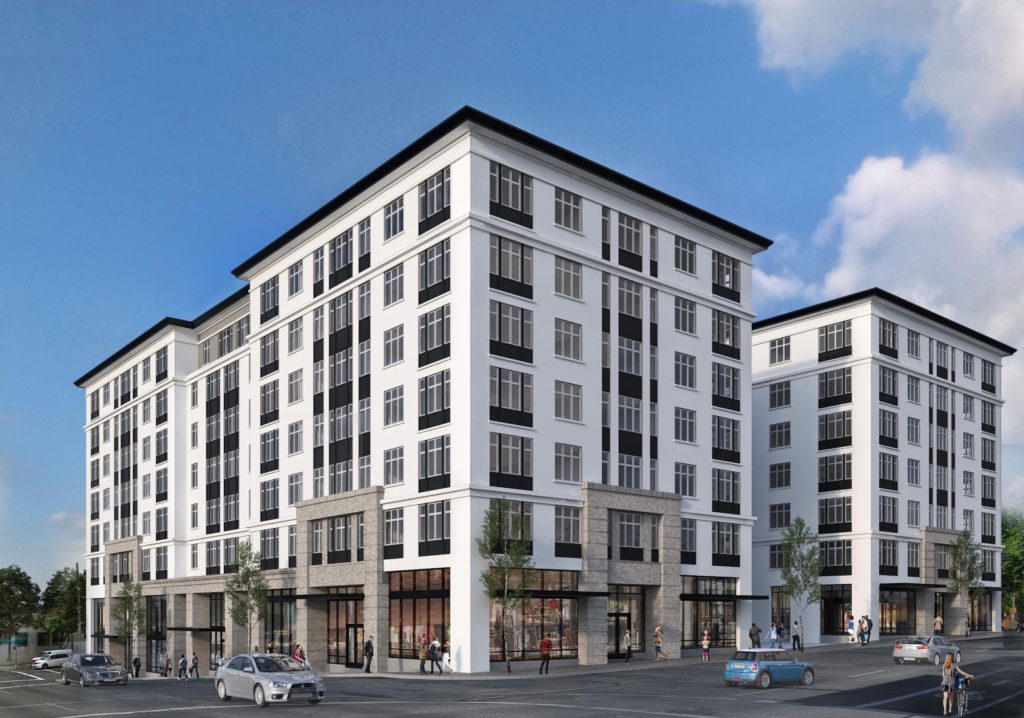
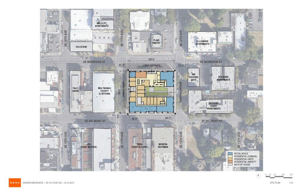
The project site is a full block at 1120 SE Morrison St, bound by SE Morrison, 12th, Belmont, and 11th. The site is currently occupied by a single story warehouse, parts of which date back to 1906.
One block to the south of the Modera Morrison site is the under-construction Modera Buckman. Other buildings recently completed, under construction or planned on the lower Belmont / Morrison corridor include the Goat Blocks and the Goat Blocks 888 building, Alder.9, Modera Belmont, Grand Belmont and the 12-story building adjacent to the Weatherly.
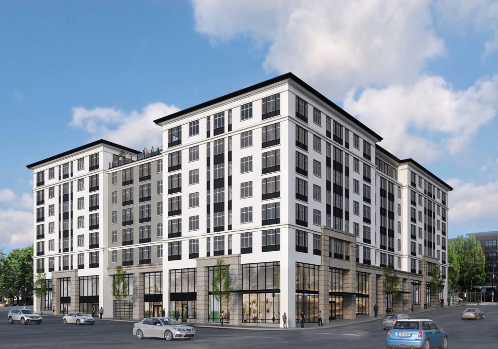
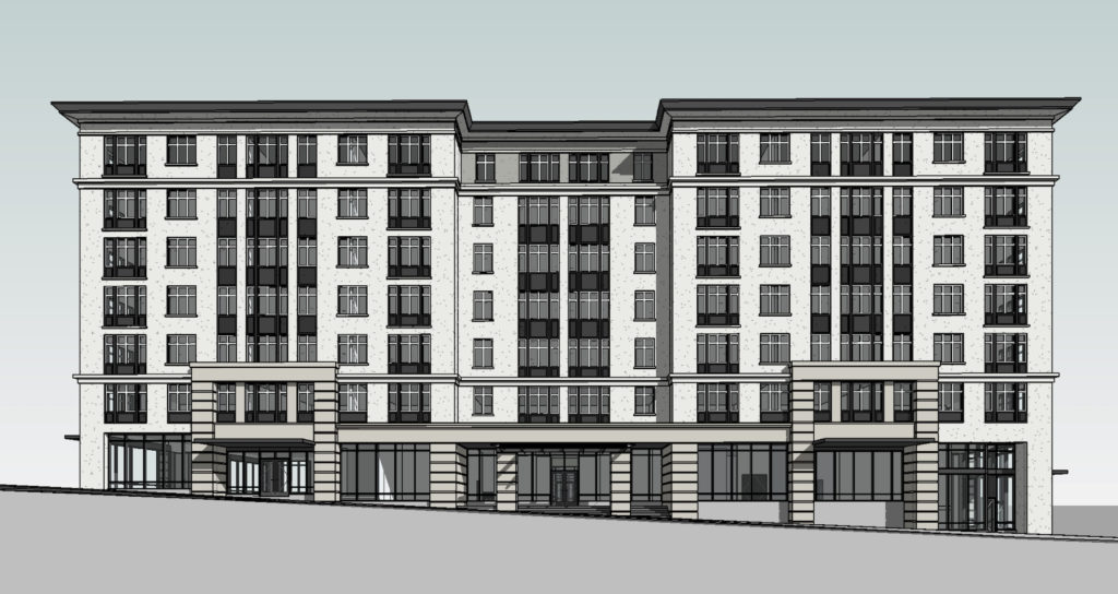
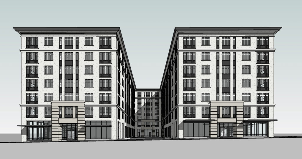
The building will be arranged in a U-shaped plan, with an east-facing courtyard that meets the ground at SE 12th Ave. Parking would be accessed from SE 11th Ave, one story below the first floor level. Ground floor retail would be located along SE Belmont St and 12th Ave, with a small retail unit at the corner of SE Morrison and 11th.
The primary material proposed for the Modera Morrison is stucco, with vinyl windows and painted fiber cement spandrels beneath the windows. Brick veneer and aluminum storefront glazing would be used at the lower two levels.
The project went in front of the Design Commission for an initial advisory meeting on May 16th. Much of the discussion was focused on the form and massing of the building, as noted in a summary memo:
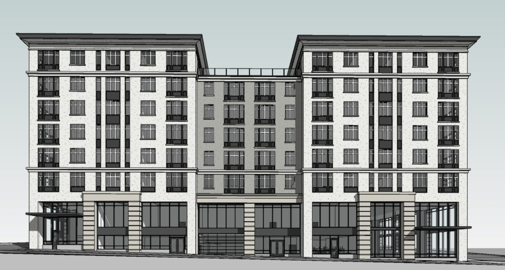
The Commission acknowledged that for a U-shaped building, a courtyard facing east was preferred. However, they suggested that the building was so massive that the impact to the adjacent neighborhood could be reduced by splitting the building into two north/south-oriented bars with the west bar responding more to the large footprint massing of the industrial neighborhood to the west and the east bar broken into smaller massing expressions to better relate to the smaller-scaled residential neighborhood to the east. An elevated north/south-oriented terrace could provide open space to upper level units. Belmont should remain a strong retail street with no blank walls. The Commission stated that they expected the applicant to return with no request for a ground floor windows or ground floor active use Modification. The Commission stated that a more modern expression was more appropriate in that it could better blend into the neighborhood west of 12th and help to break down the mass along 12th.
The Modera Morrison is currently scheduled to return in front of the Commission for a second Design Advice Request meeting on July 18th.
Drawings
Plan | Site 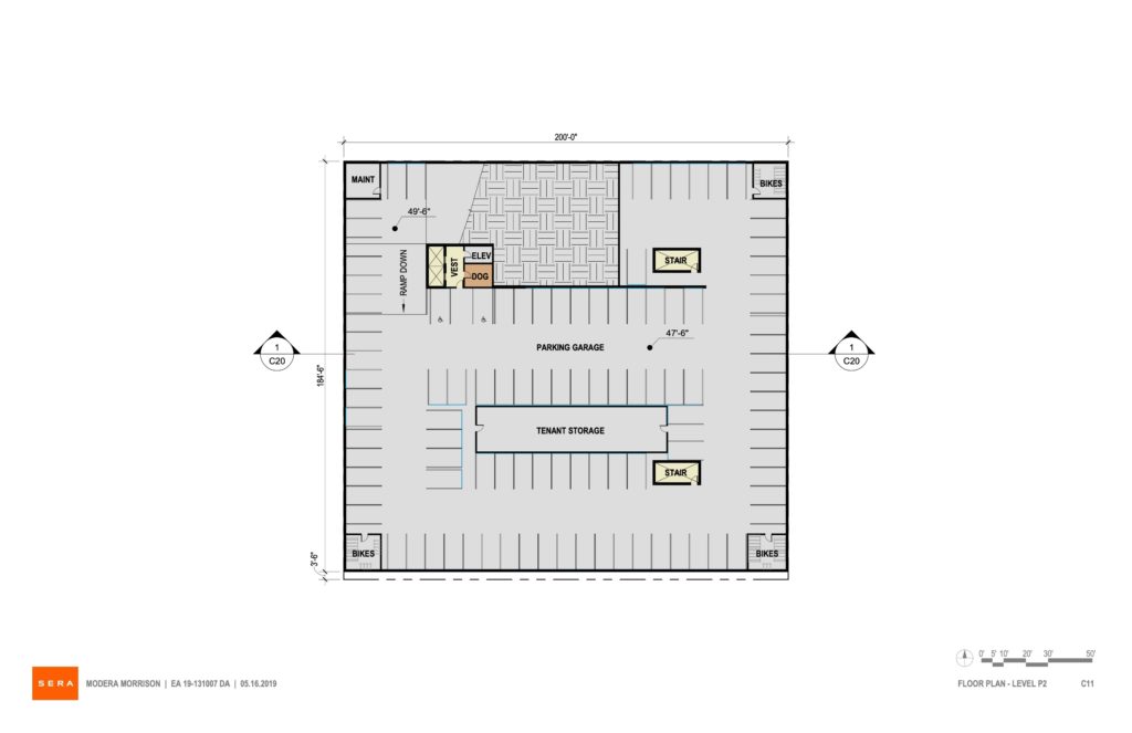
Plan | Level P2 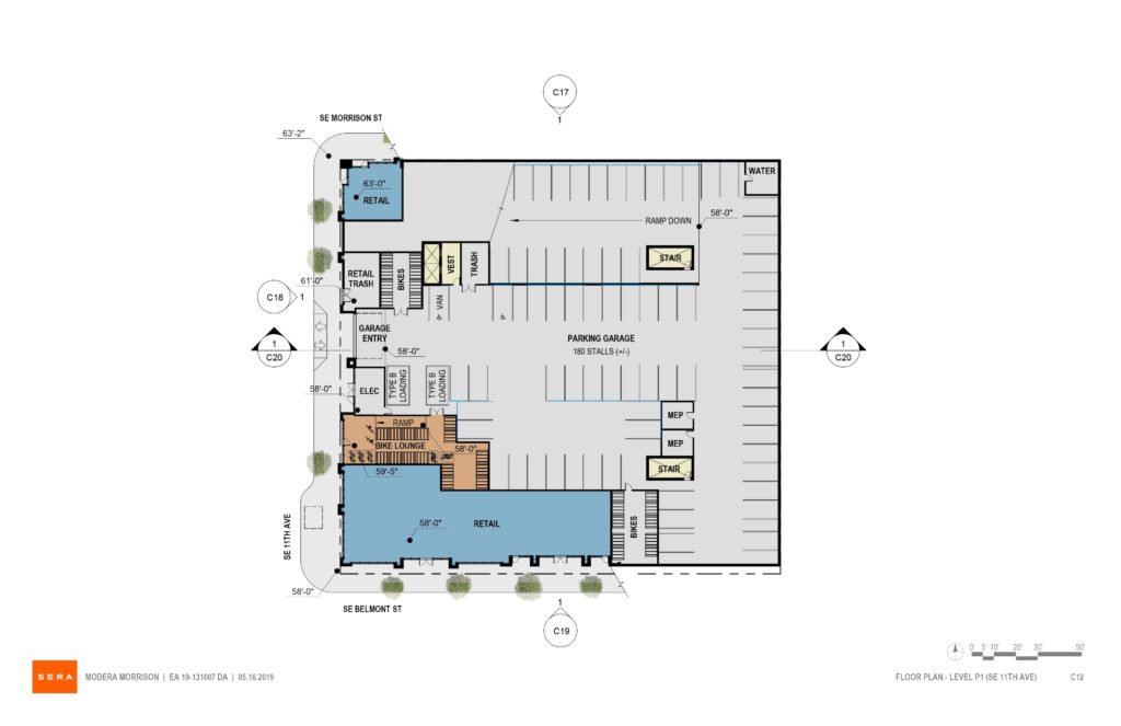
Plan | Level P1 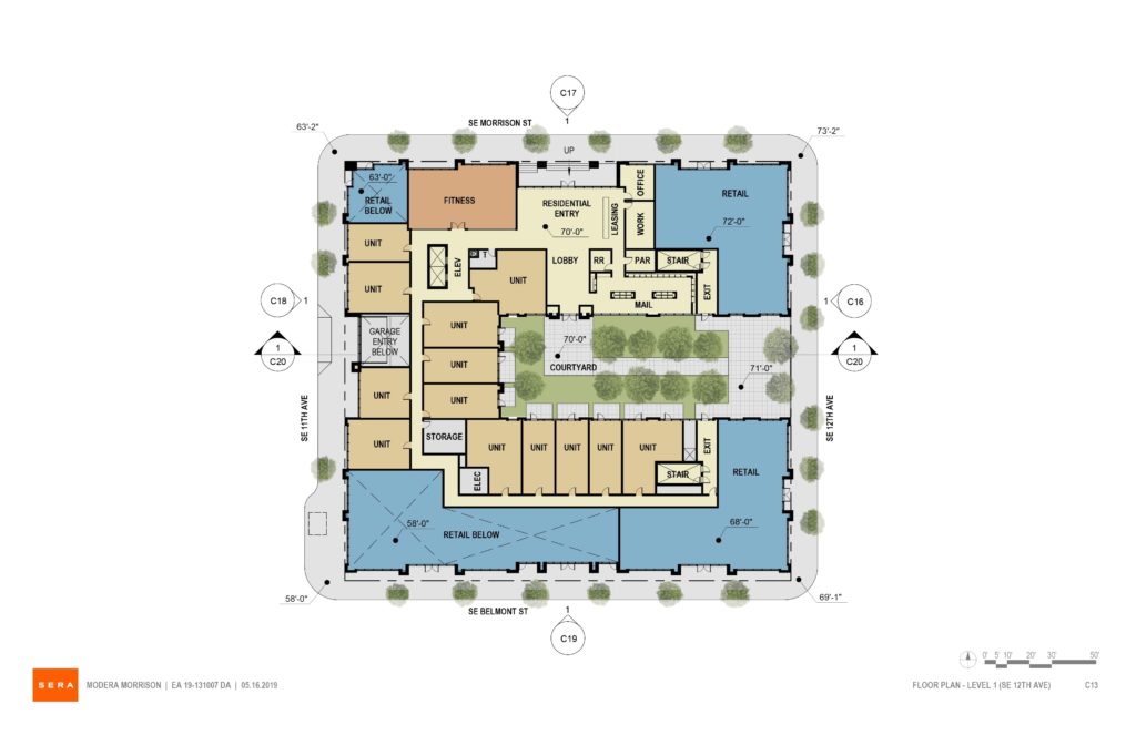
Plan | Ground 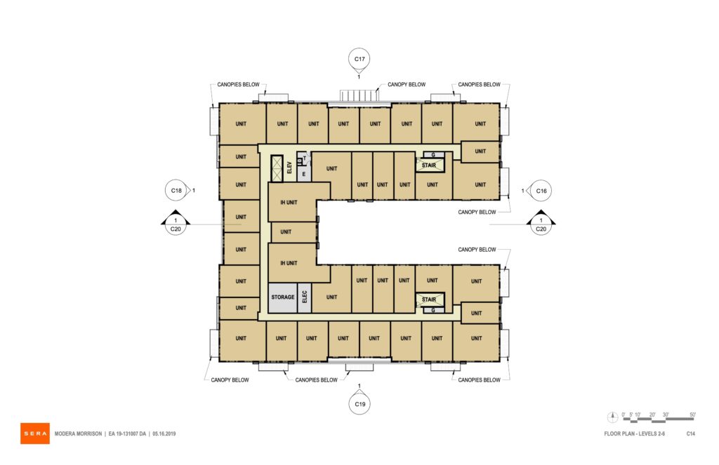
Plan | Levels 2 to 6 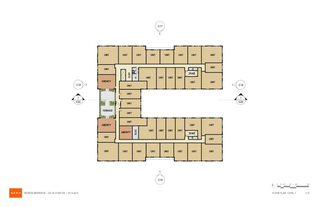
Plan | Level 7 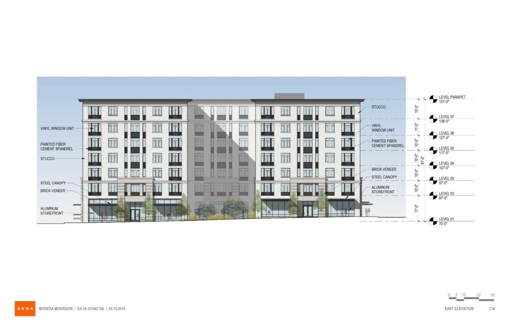
Elevation | East (SE 12th) 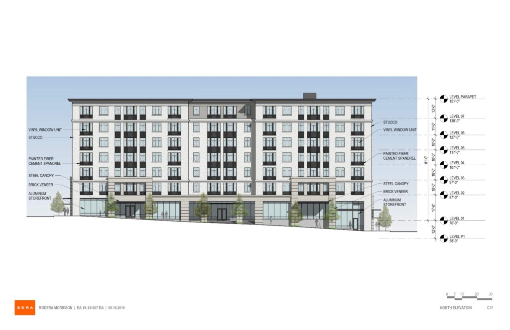
Elevation | North (SE Morrison) 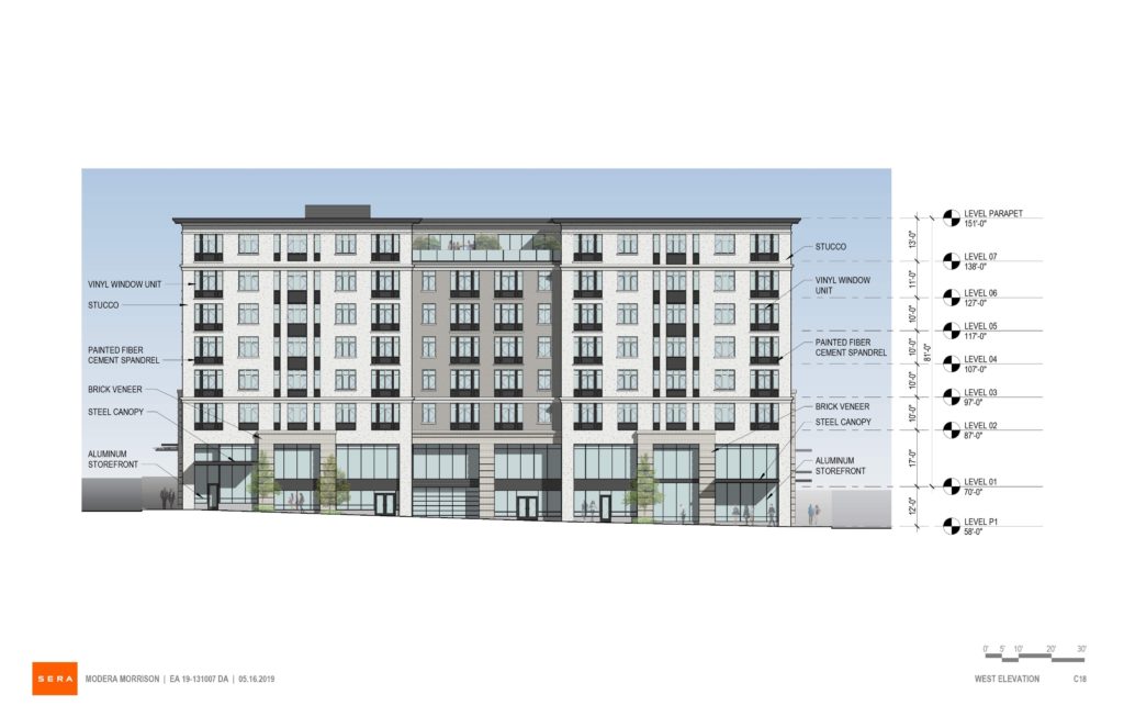
Elevation | West (SE 11th) 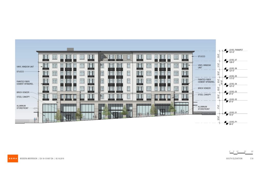
Elevation | South (SE Belmont) 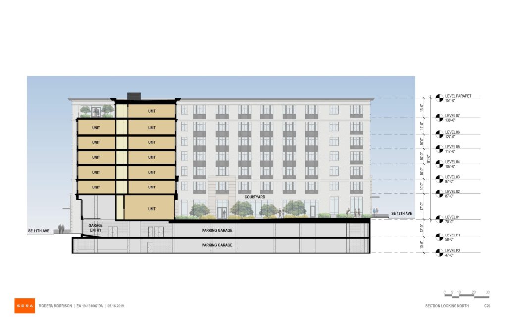
Section
It sounds like DC wasn’t actually asking for a reduction in size on the east side, just a break up of massing, right? After all, there’s a 5-story building right across 12th, for half the frontage, and zoning would allow the other half to fill in to that size as well. No need to defer to the one-story martial arts studio.
another SIM CITY inspiration
There are so many large buildings near it. What are they talking about it being too massive? It looks fine to me. I live in that area, and this is the best looking building I’ve seen offered. There are several old apartment buildings in the area that are in this U-shape, both east and west of 12th. It goes with a bunch of stuff. I don’t know what the design commission is smoking.
Please do something more modern and authentic, this looks like so much of the faux-high-end buildings you see in southern California. I can already see the Abercrombie & Fitch in that ground-floor retail.
love the art deco style of the building brick is nice to
What a relief to see some detail and aesthetics other than a glass box with cantilevered glass awnings and a staggered grid of windows. The design commission has no sense of charm and character that appeals to many and instead continues to foster the generic aesthetic ugly box as usual and our city landscape becomes homogenized to all look about the same.